
PoSSMM Logo
Industry: State Gov
Project type: Branding & Logo Design, UX/UI Design
Role: Visual & UX/UI Designer
Project duration: 5 weeks
About the Client
The West Virginia Department of Natural Resources is a state government agency responsible for managing and conserving the state's natural resources, including wildlife, forests, parks, and waterways. Because it oversees the protection and monitoring of so many types of data, they needed an application to maintain their database, and with that; a need for a logo!
When I joined Timmons, the WV DNR portal was already in the beginning stages of development and the design direction was figured out by my predecessor. The only thing we had left to figure out was final confirmation on the name of the application so that we could develop branding for it. Once the WV DNR team decided that the loved PoSSMM (Portal of Species, Surveys, Monitoring and Measurement) I started doodling as many opossums as I could come up with!
The Ask
While some of the design direction of the application was figured out ahead of time, we were in need of an identity for PoSSMM that would align to the brand standards already set for WV DNR and some adjustments to the interface as we made changes.

Screenshot from the iconography page of the WV DNR style guide
The Method
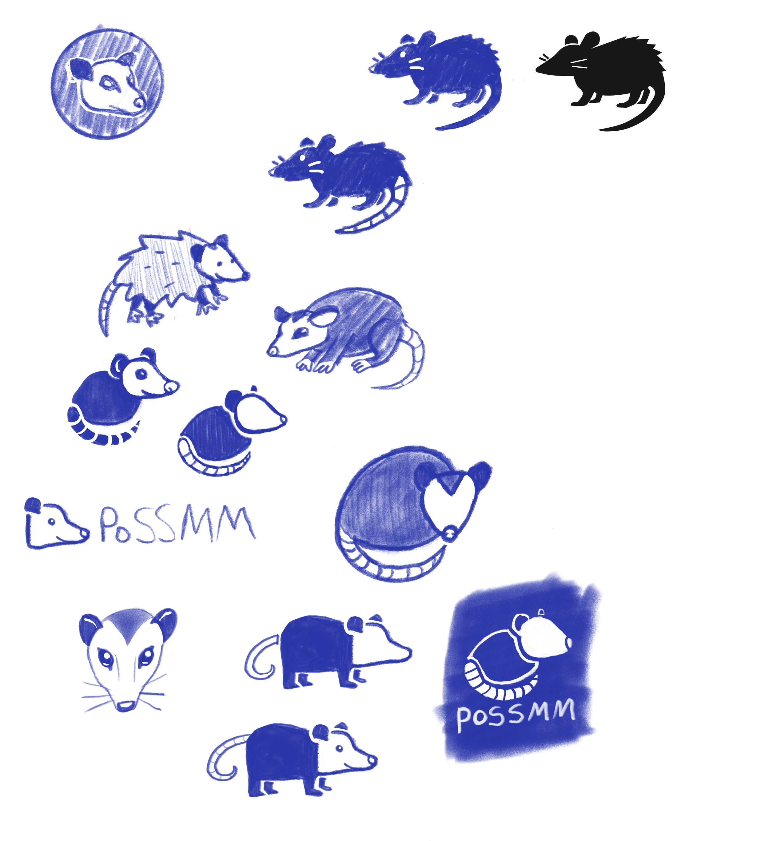
Once I knew the name of the application, I immediately set out doodling oppossums. I started with sketches on my iPad pro and once I had run out of initial concepts, I brought them to the WV DNR team and my Timmons teammates for feedback.
Folks were really drawn to the rounded, abstract opossum in the bottom right corner, but I wanted to explore another treatment as well that looked more like the iconography in the brand guide. So I set out exploring concepts, getting feedback from fellow designers and created some polished versions to present to the WV DNR team.
The Result
After a few rounds of exploration and narrowing down to the strongest treatments, I presented the final options to the WV DNR team with the logos isolated and also in the place they’d see it most— in the top left corner of the application! The entire team loved the direction I went in and everyone gravitated towards the rounded, stylized opossum that was the final product of the original concept they initially liked. Their only feedback for me was that they wanted the top left logo of the 5 that I presented to be the final version, but with the body outline of the opossum with an orange fill. I loved this approach, made the change, and got a resounding approval from the client! They are very happy with their logo, in all of the possible file types I could deliver.
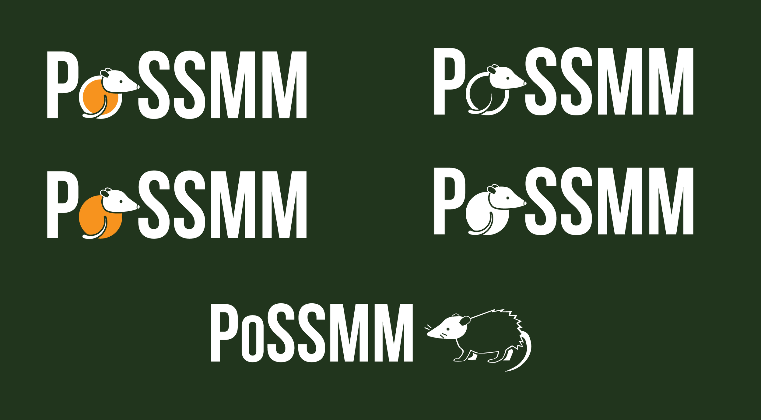
The final options presented to the client, which resulted in an approval with the smallest of adjustments.
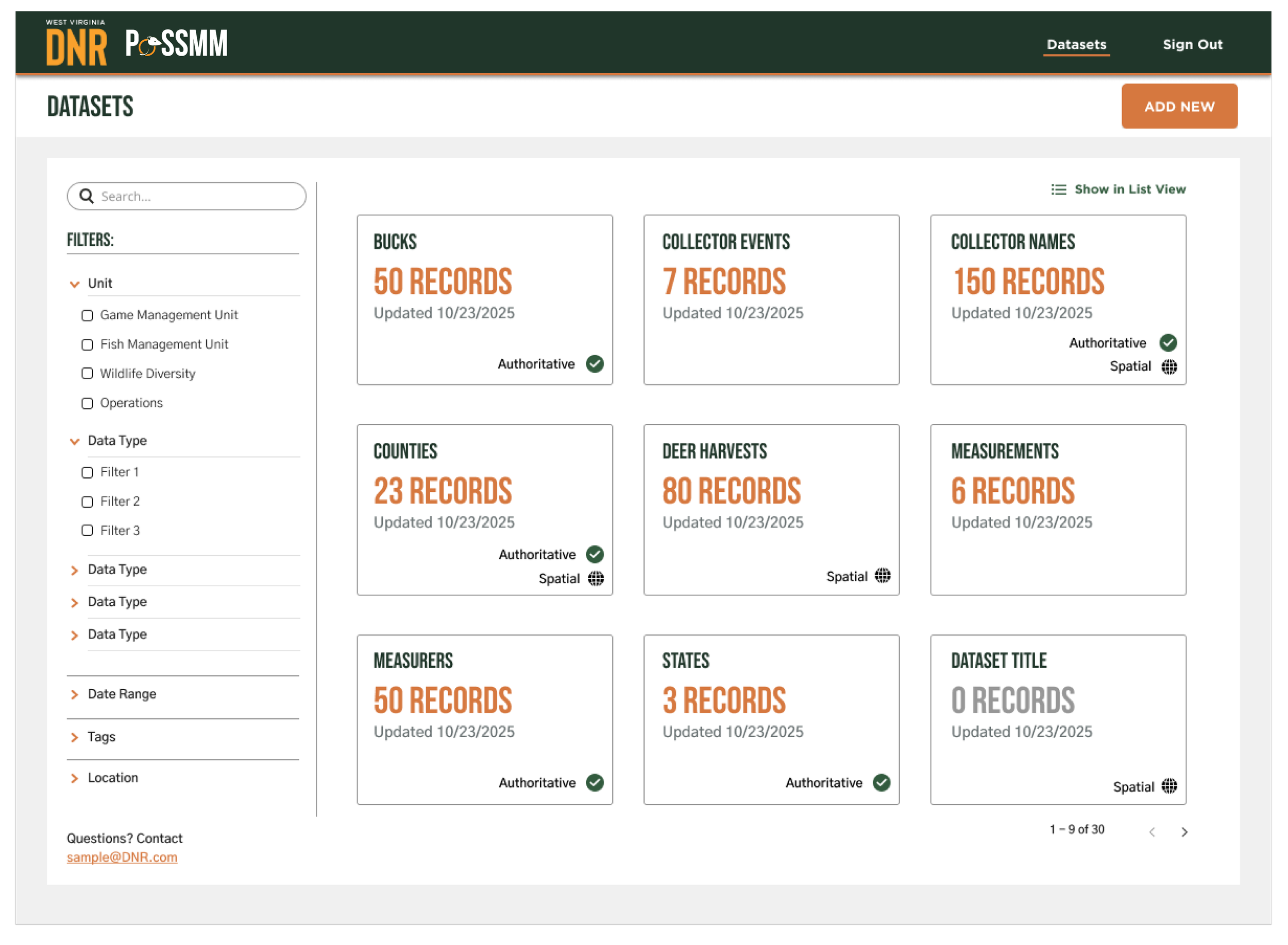
A screen grab of the initial UX design featuring the final logo design in the top left corner. This is what the client saw after I presented the final logo design to make sure they were happy with it in it’s environment.
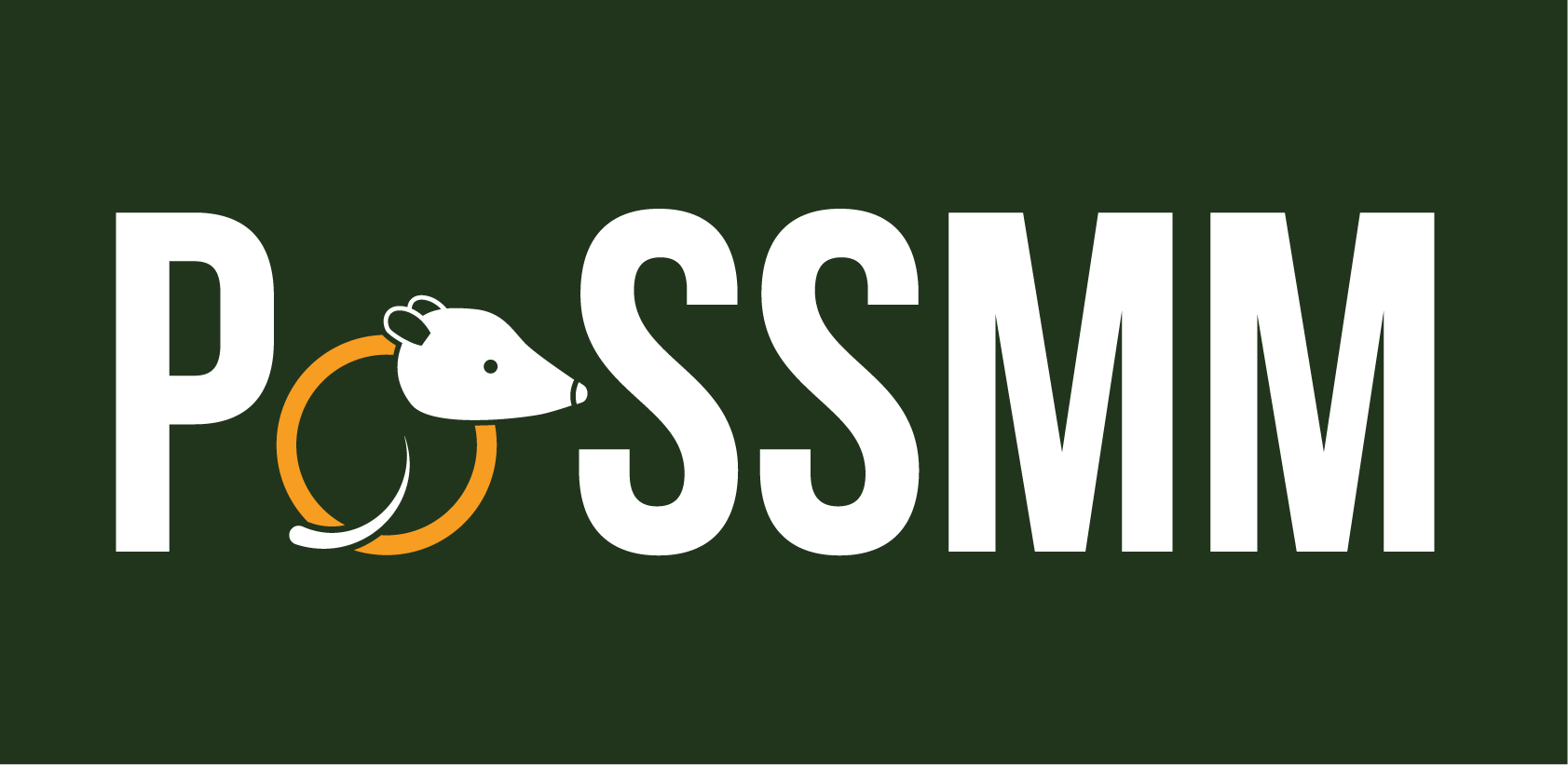
Final Logo design